
Technical indicators are indispensable allies in day-to-day trading. With their help we can easily track and analyse the seemingly chaotic price movements on the markets, anticipate the direction of the next price trend, or assess when is the best time to open a profitable position.
Many experienced traders, however, consciously avoid these useful tools, intimidated by their apparent complexity. If you are one of those traders, don’t be in a hurry to leave just yet, because we have some good news—technical indicators don’t require a rocket science degree!
All you need is a bit of patience, a dash of persistence, and a place where you can test your strategies free of charge and without any risk of losing your funds. Without further ado, let’s take a proper look at the 7 most popular technical indicators in the global trading community!
What are technical indicators?
Today, almost all trading platforms on the market (Delta Trading included) offer their users a wide variety of indicators to choose from. Simply put, technical indicators are mathematical equations which help us measure changes in the price or trading volume of an asset. We can also use them to confirm the data provided by another technical indicator.
We recognise two types of indicators:
– Leading technical indicators
– Lagging technical indicators
Types of technical indicators
Leading indicators
This category includes indicators that predict price movements in the near future. The main drawbacks of using leading indicators is that they can sometimes generate false buy or sell trading signals.
Popular leading indicators include:
– Stochastic indicator
– Moving Average Convergence Divergence (MACD)
– Relative Strength Index (RSI)
Lagging indicators
As you could probably tell from their name, these indicators inform us when a market trend has already started. Somewhat more reliable than leading indicators, they also have a few weak points, the main of which is their tendency to delay trading signals.
Popular lagging indicators include:
– Moving average
– Bollinger bands
Now that you’ve learned which are the two main indicator types, it’s time to take a closer look at the technical analysis tools themselves.
#1. Moving average (MA)
The moving average helps us determine what is the average market price of a given financial instrument over a specific period of time. Many traders often use this information to buy when the instrument’s price goes above the MA border, and sell when it goes below it.
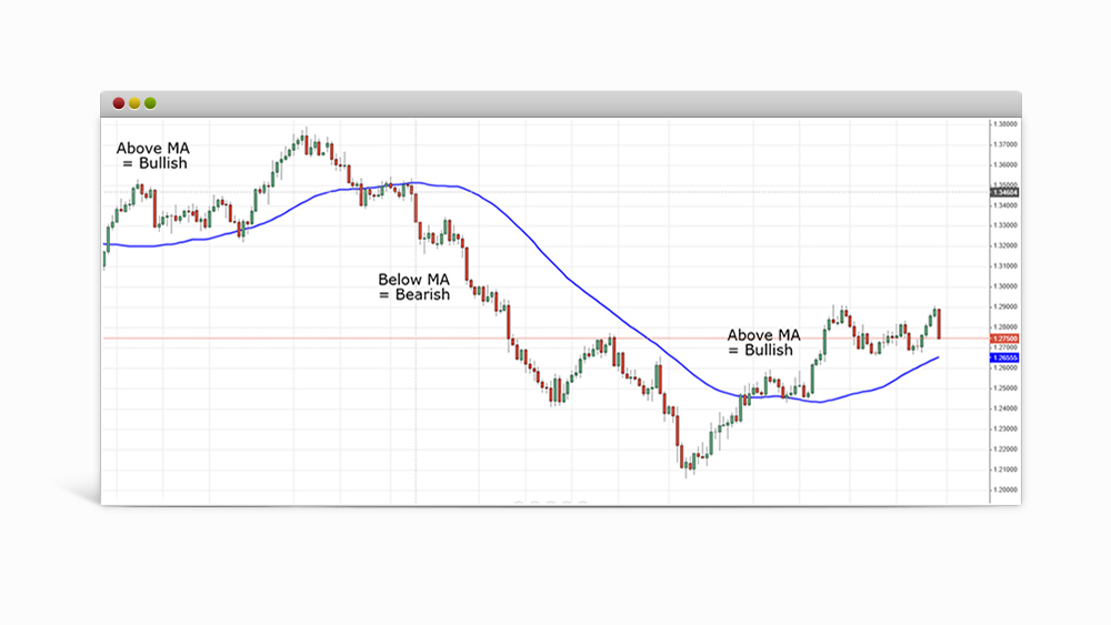
On the chart above we can see the indicator in action. When the instrument’s price candles are located above the blue MA border, the indicator signals for a bullish market (the price is expected to follow an uptrend). In case the candles have sunk below the blue MA border, the indicator will signal for a bearish market (the price is expected to follow a downtrend).
Before using this indicator in your trading session, you’ll need to determine the timeframe which the MA will track. For the most part, this will depend on your specific trading goals. For instance, following MAs with a shorter time span is a popular approach among day traders (speculants who open, and then close, their positions on the market before the day ends). In contrast, longer MAs are frequently used when engaging in long-term trading.
#2. Relative Strength Index (RSI)
RSI is the oldest and perhaps the most used technical indicator of the bunch. Invented by J. Welles Wilder back in 1978, the indicator is an “oscillator” since its values can change (oscillate) between 0 and 100.
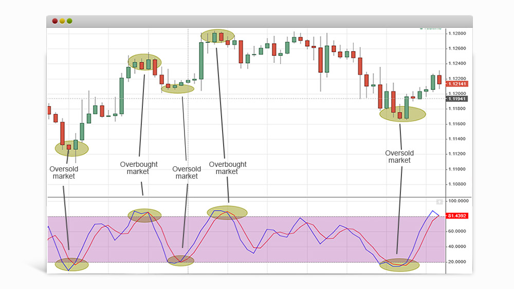
RSI values exceeding 30 typically signal that the market is oversold. Conversely, values above 70 would indicate that the market is overbought. Here, it’s important to keep in mind that these values are only ballpark estimates and may vary depending on the assets you’re trading.
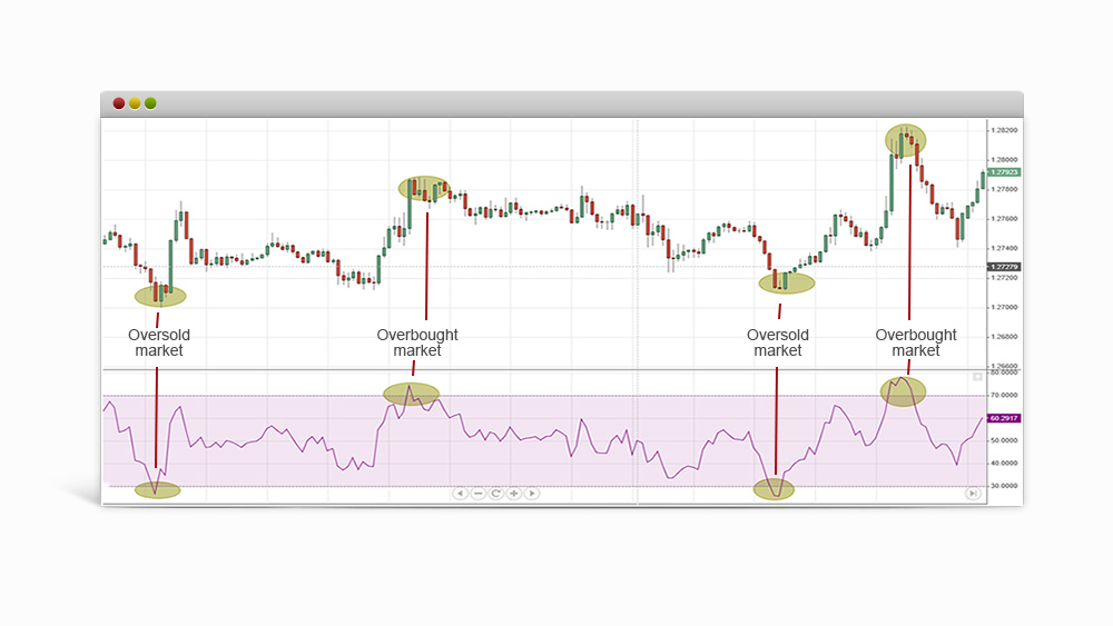
RSI helps traders predict a sudden price hike or dip in a given financial instrument and thus minimise potential financial losses. Broadly speaking, the indicator’s calculations boil down to the following: the RSI compares the “strength” of the hikes and dips in an asset’s price within a specified time frame (usually 14 days).
In the price chart above, the areas coloured in yellow signal that the market is either overbought (peaks above the upper RSI border) or oversold (dips below the lower RSI border). A closer look at the chart would reveal that the weakened price is soon followed by a bullish trend and vice-versa.
#3. Bollinger bands
Bollinger bands are an indicator based on market volatility. The indicator tracks changes in an asset’s price over a certain time period. Typically, Bollinger bands are represented by a red and green border or as two red borders that enclose the price chart from above and below.
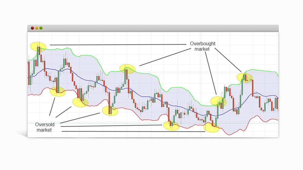
When the market price crosses the upper border for an extended period of time (the yellow circles located above the green border), the indicator signals that the market is overbought (the instrument is selling for more money than its actual worth).
On the other hand, when the bottom border is crossed (the yellow circles located below the red border), the indicator signals that the market is oversold (the instrument is traded at a value lower than its actual worth).
Another thing you have to keep in mind here is the distance between both borders (bands) of the indicator. The more these bands move closer together, the lower the market price volatility will be and the other way around.
#4. Moving Average Convergence-Divergence (MACD)
This puzzlingly named indicator is a must-have in every trader’s arsenal. It allows us to determine the type of market trend we’re analysing (bearish or bullish), as well as measure its intensity and duration. This data can then be used to identify buy and sell opportunities around support and resistance levels.
Just like the RSI, MACD is an oscillator. Unlike it, however, the indicator does not remain “locked” between certain values that could tell us if the market is overbought or oversold. Let’s take a good look at the price chart below:
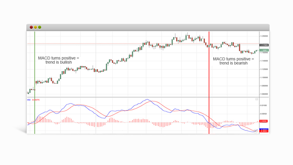
At its core, MACD is a tool that measures the difference between a short-term (12-day) and a long-term (26-day) moving average. On the chart, MACD is represented through a blue border. The red border is a 9-day moving average whose performance is measured by the difference between the short-term and the long-term moving averages. Traders often monitor the red border to look for buy or sell opportunities.
The histogram below both red borders (bands) measures the trend’s “momentum”: the longer the histogram’s bands are, the more momentum a trend has. At first more complicated compared to the indicators shown so far, MACD becomes much easier to understand when you remember the following:
– If the blue band is located above the histogram’s centre, this may signal a bullish trend.
– If the band is located below the histogram’s centre, this may signal a bearish trend.
#5. Fibonacci
Based on the famous number sequence by the Italian mathematician Leonardo Da Vinci, this technical analysis tool is used to measure the price volatility of a given asset, as well as to identify specific levels of support and resistance in order to predict future price movements.
Among the more renowned Fibonacci trading tools are the:
– Fibonacci retracement
– Fibonacci extension
Fibonacci retracement
This instrument tracks price swings that could potentially change the price trend’s direction. The main retracement values that we should monitor here are 23,6% (0,236), 38,2% (0,382), 50% (0,5), 61,8% (0,618), 78,6% (0,786) and 100% (1). For your convenience, the Fibonacci retracement tool in Delta Trading will automatically input these values on a desired price chart.
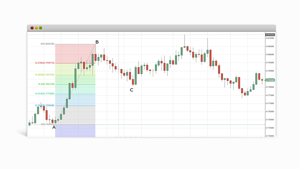
In the chart above, we are observing a correction towards a bullish market (point “A” to point “B”). If we were to examine the price fluctuations between both points we would discover that this is, for the most part, a bullish trend, at least until it crosses the critical value of 23,6%. What follows is a significant retracement (point “B” to point “C”). Notice how, once it reaches a value of 50%, the downtrend loses its momentum and reverses.
Fibonacci extension
As we saw above, the Fibonacci retracement tool is used to monitor price swings between points “A” and “B” in order to predict the trend’s next move—point “C”. To make effective use of the Fibonacci extension tool, however, we would first need to know the whereabouts of point “C” as this tool operates a bit differently than Fibonacci retracement.
Here, in addition to gauging the price swings between points “A” and “B”, we would also need to do the same for points “B” and “C”. The main retracement values to watch for are:
– 8% (0.618)
– 100% (1)
– 8% (1.618)
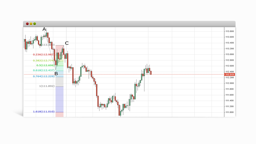
In the chart above, we’re observing a bearish trend. While the price is maintaining a steady downward trend between “A” and “B”, it eventually turns into a bullish trend between “B” and “C”. Since the price has now reached C”, we could connect the three points and use the trend’s past performance to try and predict its next move. In this example, the market turns bearish, followed by another upward retracement.
#6. Stochastics indicator
This indicator measures market momentum and is used to predict when a price trend is about to end. Similar to the RSI, stochastics values also show us when an asset is overbought or oversold. To calculate this, the indicator takes a set price at which the financial instrument has closed, and compares it to its performance over a certain period of time.
The values, which range from 0 to 100, show us the market trend’s strength. Key levels to look for here are 20 and 80. Values under 20 suggest that the market is overbought, while values over 80 indicate an oversold market. Depending on how strong the trend is, reaching these values won’t necessarily mean that an abrupt price change is headed your way.
Typically, the indicator will be visually represented through 2 distinctly coloured bands, drawn in a separate “mini” chart. When the indicator crosses the pink chart’s upper border, momentum slows down and the price is expected to decrease, while a crossed bottom border would mean that a strong uptrend might be on the way. As you may have probably guessed, many traders count on this information in order to “ride” the next market trend as early as possible.
#7. Ichimoku cloud
The Ichimoku cloud is especially popular in the global trading community. It has its fair share of quirks, however, which is why we’ll take a more extensive look at it in a future article. For now, what you need to know about this indicator is that its main goal is to help us determine the price trend’s direction.
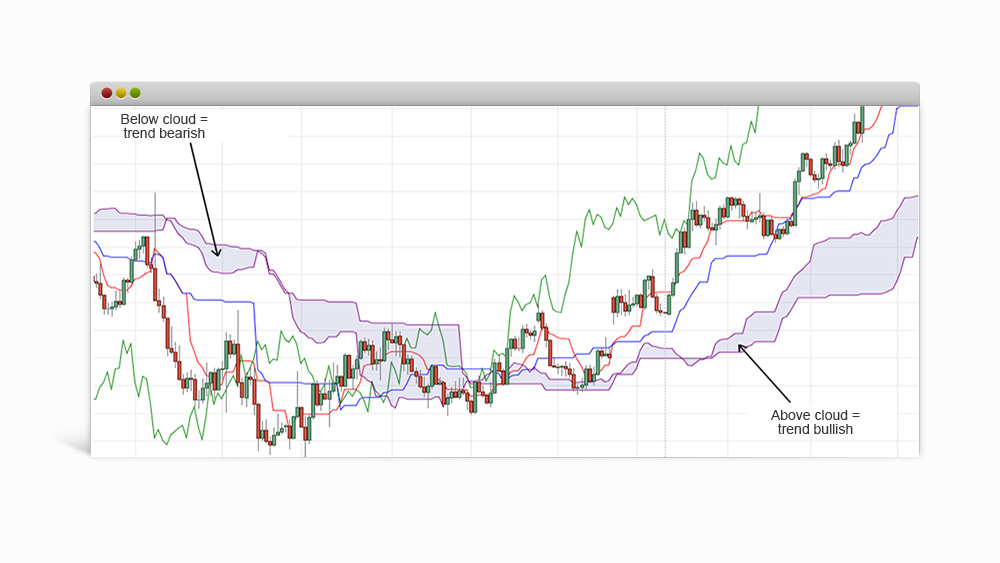
When the candles are located above the “cloud” (the purple-coloured space on the chart above), the trend is defined as bullish and you can benefit from opening long positions. When the price sinks below the cloud, the trend is defined as bearish and opening short positions is more advisable.
Some guidelines for using technical indicators

Source: unsplash.com| Photographer: Mihai Surdu
Regardless if you trade within the regular market hours or prefer swing trading, using too many indicators can yield confusing results that could potentially result in losses.
For instance, monitoring a price trend in the short-, long- and middle-term at the same time might look like a good idea at first. However, many experienced traders share that such a move has prevented them from capitalising on great trades on more than one occasion since they were unable to determine which of the indicators was telling the truth.
Of course, determining which indicators are useful and which aren’t is more or less subjective and greatly depends on the market conditions and on the trader’s knowledge and preferences. Due to this we would like to share with you 3 tried and tested tips that will help you get the most value out of your technical analysis.
Tip #1: Don’t mix overlapping indicators
Traders often fail to realise that they’ve placed indicators generating similar trading signals until they let a great trade slip away due to misleading data. This is why you should always combine indicators that compliment each other. A general rule of thumb is this: every indicator pair should consist of a leading and a lagging indicator.
Depending on your trading goals, you would also have to take into account the several subtypes of indicators, the most popular of which are:
– Trend indicators. Used to predict the price trend’s direction (uptrend or downtrend). Example trend indicator: MACD.
– Momentum indicators. Used to gauge the price trend’s strength. Example trend indicator: RSI.
– Volatility indicators. Used to measure price fluctuations of a given asset within a desired time period. Example trend indicator: Bollinger bands.
– Volume indicators. Used to determine what amount of the asset we’re monitoring (for instance bitcoin amounts) is traded within a desired time period.
Tip #2: Less is more
Many seasoned traders think that there’s rarely any point in tracking more than 5 indicators at a time. Because of this, a good approach is to test several different indicators, from which you can leave 3 or 4 that you’ve found the most useful for analysing your traded market.
Tip #3: Frequently revisit your strategy
No matter which indicators you end up using, don’t forget to measure just how much mileage you get from them in your day-to-day trading sessions. The next time you open up your platform, review the indicators you’re currently using and try to determine if they have any flaws (one such flaw could be delayed trading signals).
If you find any, think what indicator(s) you could use in their place, or try to alter some of their built-in values until you find the combination that is tailored to your workflow and trading strategy.
Risk warning: The information and technical analysis values mentioned in this article have been provided for educational purposes only and should in no way be interpreted as signals to buy or sell a financial instrument.
***
Finding the perfect technical indicators for your needs doesn’t have to come at a cost. Test each of the indicators in a safe market environment with a free €10,000 demo account.